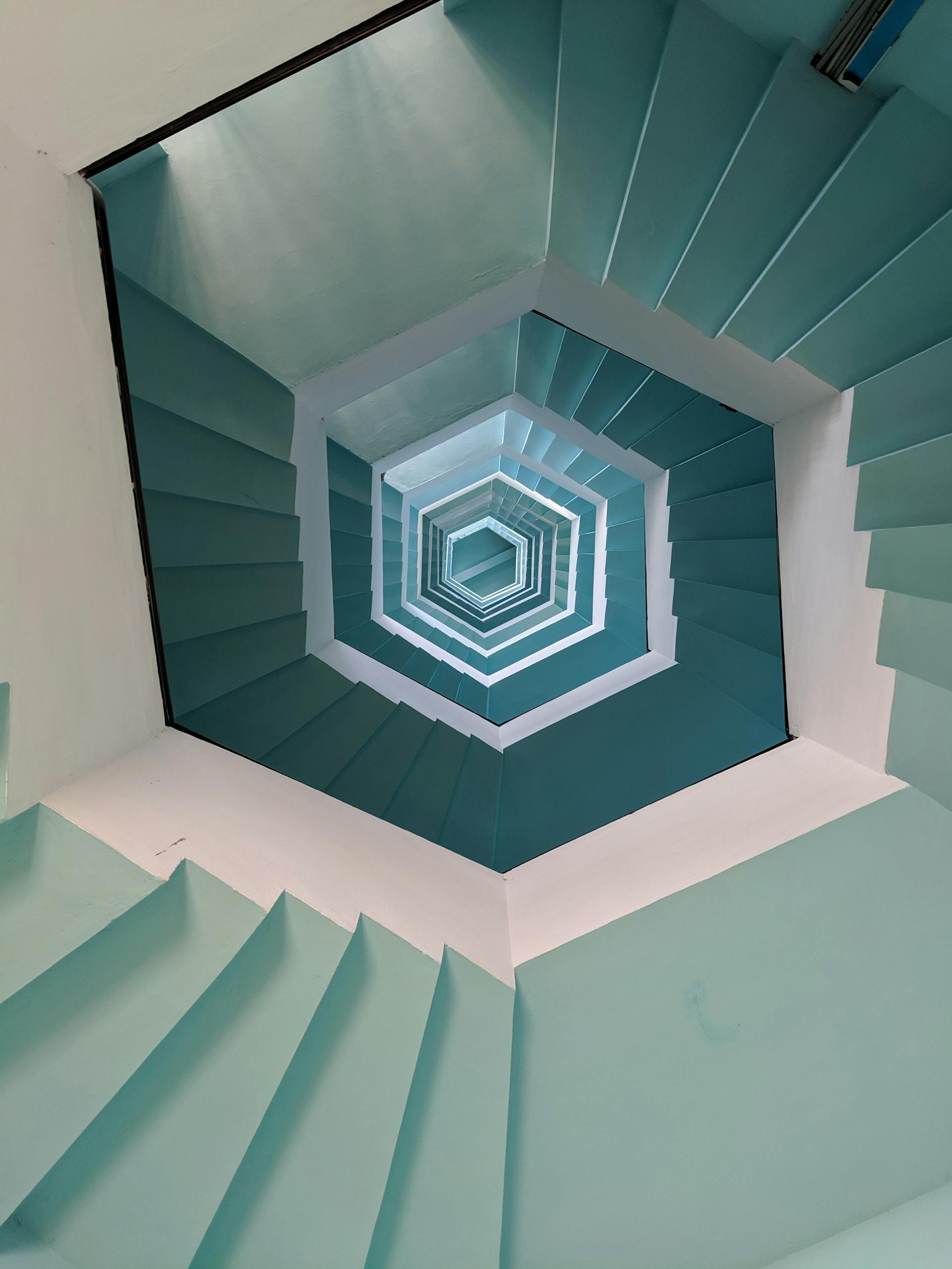
The Art of Minimalist Design: Less Is More


In a world filled with noise and clutter, minimalist design stands out as a beacon of simplicity and elegance. Embracing the principle of “less is more,” minimalist design focuses on essential elements, clean aesthetics, and functional simplicity. In this article, we’ll explore the art of minimalist design and how it has become a powerful force in the world of aesthetics and functionality.
Minimalist Design Principles
Minimalist design is guided by several key principles:
- Simplicity: Reducing designs to their essential elements, eliminating unnecessary details.
- Functionality: Prioritizing the functionality of a design, ensuring it serves a clear purpose.
- Whitespace: Incorporating ample whitespace or negative space to create a sense of openness and clarity.
- Balance: Achieving visual balance through careful placement of elements, often following the rule of thirds.
Simplicity in Design
At the heart of minimalism is the idea that simplicity enhances user experience. By removing distractions and complexities, minimalist design allows users to focus on what truly matters, whether it’s the content of a website, the usability of an app, or the message of a poster.
Functionality and Aesthetics in Minimalism
Minimalist design seamlessly combines functionality with aesthetics. Every element, color, and typography choice serves a purpose and contributes to the overall visual harmony. In minimalist design, aesthetics are not compromised in pursuit of simplicity; they are enhanced.
Minimalist Color Palettes and Typography
Minimalist color palettes often feature neutral tones like white, black, gray, and earthy colors. Typography in minimalism is clear and legible, with an emphasis on simplicity. Sans-serif fonts are common in minimalist design due to their clean lines.
Minimalist Design in Web and Mobile Interfaces
Minimalist design is widely embraced in web and mobile interfaces. It enhances user navigation and creates a more enjoyable browsing experience. Websites and apps with minimalist design are often responsive, focusing on user needs and offering clear, uncluttered layouts.
Minimalist Design Case Studies
Examining real-world examples of minimalist design can provide insights into its effectiveness. Case studies demonstrate how minimalist design principles can be applied across various mediums, from branding to product packaging.
Achieving Balance in Minimalism
Balance is crucial in minimalist design. Achieving harmony between elements requires careful consideration of their placement, size, and visual weight. Balancing negative and positive space is also essential in creating a cohesive design.
Minimalist Design Trends
Minimalism continues to evolve, with new trends emerging. Examples include minimalist illustrations, subtle animations, and the use of natural textures and materials in physical design.
In conclusion, minimalist design has transcended being a mere design trend; it has become a timeless philosophy. By embracing simplicity, functionality, and aesthetics, minimalist design creates impactful and memorable visual experiences. It serves as a reminder that, in the world of design, less is often more.


